7) What were the effects of the 2011 floods?


You are going to create an infographic to show some of the effects of the 2011 floods in Thailand.
This will be done in your Computer Studies lessons, but will link closely to the work that you will be doing on the causes and solutions for the floods in your Geography lessons.
What is an infographic? Click on the image below to get an easy answer, but your Computer Studies teacher will help you and there are lots of examples on this page.
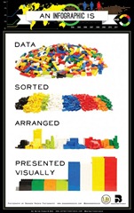 [Source: Hot Butter Studio via http://mashable.com]
You can choose whether you create an infographic for just one type of effect or for a range of different effects.
Here are some examples of infographics for other floods that have taken place in recent years. These might inspire you. Please note – these are professional infographics and may take several months for experts to create – you are not expected to make infographics as professional-looking as these, but they should give you some good ideas.
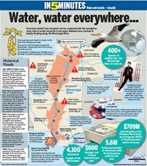
1) An infographic with lots of information.
Mississippi Floods from http://infdpv.posterous.com via http://www.emergency-response-planning.com – you can download a pdf original here.
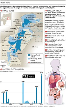
2) Another infographic packed with information:
Pakistan Floods 2010 – found on http://chicagopressrelease.com.
3) A simpler infographic with less effects included. Notice how the section on the disease cholera is general information that would be true for many floods around the world, not just the one shown here.
Pakistan Floods 2010 – found on http://www.infographicpins.com
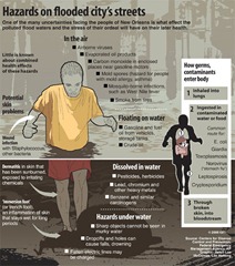
4) An infographic that focuses on one type of effect of floods in general – health problems:
Found on http://ph.she.yahoo.com

Discuss / record – what are the key ‘ingredients’ of a good infographic?

Research information that you could use to create your infographic with.
Take care – some of the web sites were created during the floods, before the full effects were known. When you research a statistic (number) such as the area of land in Thailand that was flooded, you might find that different websites give different numbers? Why? How can you deal with these differences?
2 Existing Infographics about the 2011 Thai Floods
Here are a two infographics on the 2011 Thai Floods that have already been made. You might find more through careful searching on the internet.
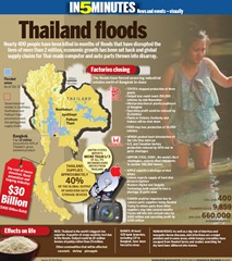
1) ‘In 5 minutes’ infographic by Reuters.
Found on http://www.pleplejung.com
2) An interesting and simple infographic showing how deep the floods were along some of Bangkok’s main roads. (Question – why does the person for Ratchaprasong look different?)
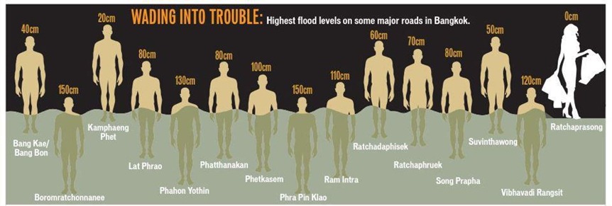
Found on http://www.bangkokpost.com/print/265781/
3) A video infographic. Although this is a youtube clip, the style of the movie is very similar to static graphics that make up most infographics. This was a very successful infographic video which went ‘viral’ when it was released during the floods, and led to several follow up animations.
Notice, this particular clip deals with the causes of the floods and possible solutions as much as the effects. It was made during the floods, when it was still unknown if the whole city of Bangkok would flood or not.
Written Information about the 2011 Floods
Medium: 2011 Thailand Floods on wikipedia
Medium: 2011 Thailand Flood Executive Summary
Medium: Back on dry land: Thailand floodwaters recede at last to reveal full devastation of monsoon rains
Difficult: 2011 Thailand Floods Event Recap Report
Difficult: Factbox: Thailand’s Flood Crisis and The Economy
Difficult: Thailand Flooding Cripples Hard-Drive Suppliers
Photo collections about the 2011 Floods
Thailand’s Disastrous, Slow-moving Flood by theatlantic.com
Thailand flood Reaches Bangkok by www.boston.com
Worst Flooding in Decades Swamps Thailand by theatlantic.com

This Post Has 0 Comments